Quick View & Ajax Cart
Overview
When customers want to view the product detail page, they have to click on the product and wait for a while to see it. So, if they want to view a product, they have to open more tabs and take more time to know more details about that product. That's why Mageplaza Quick View module is released. It helps you save more time surfing the web, see more details and increase sales for your store. Customers don't need to visit the Product Detail page to view product details, just click on the icon or label on the image, then they can view full product information through the popup displayed on the screen. This allows customers to view multiple products without spending a lot of time. Not only that, when customers add products to the cart, the popup about product details information is also displayed and that product will automatically fly into the cart quickly.
How to download and install
- Download Mageplaza Quick View
- How to Install
How to use
1. Quick View Popup
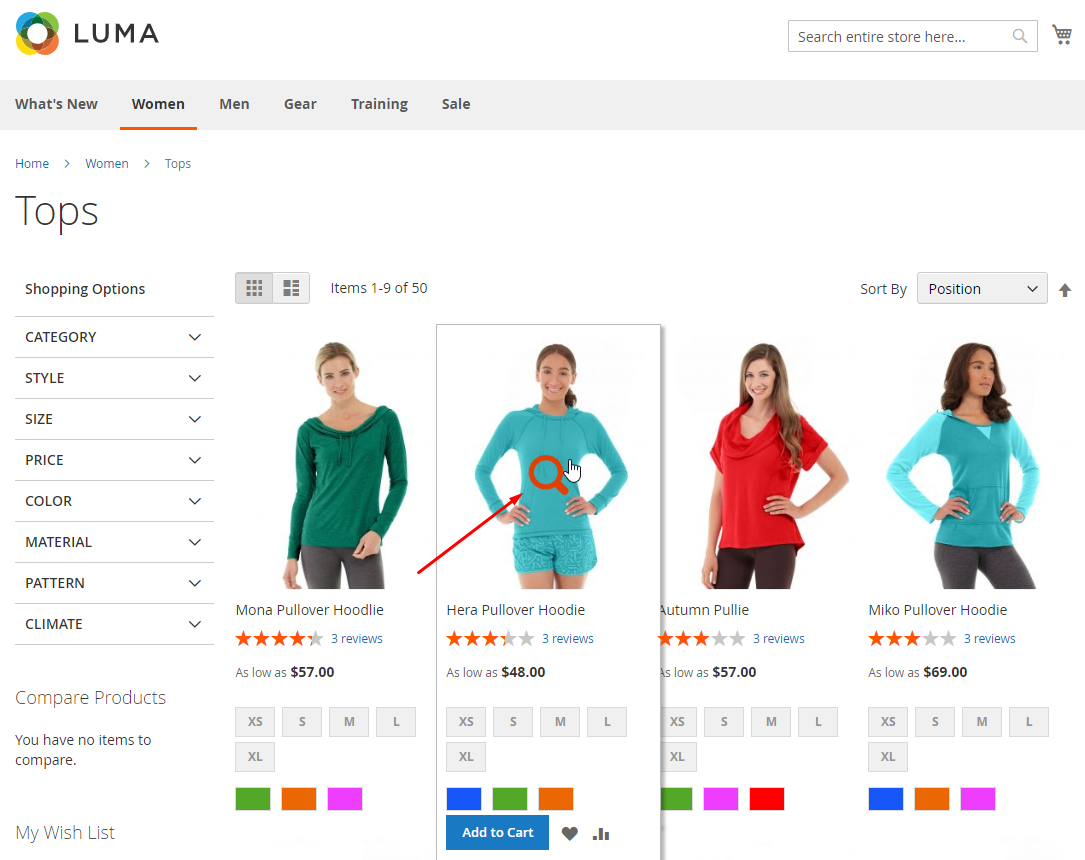
1.1. Display the icon on the product
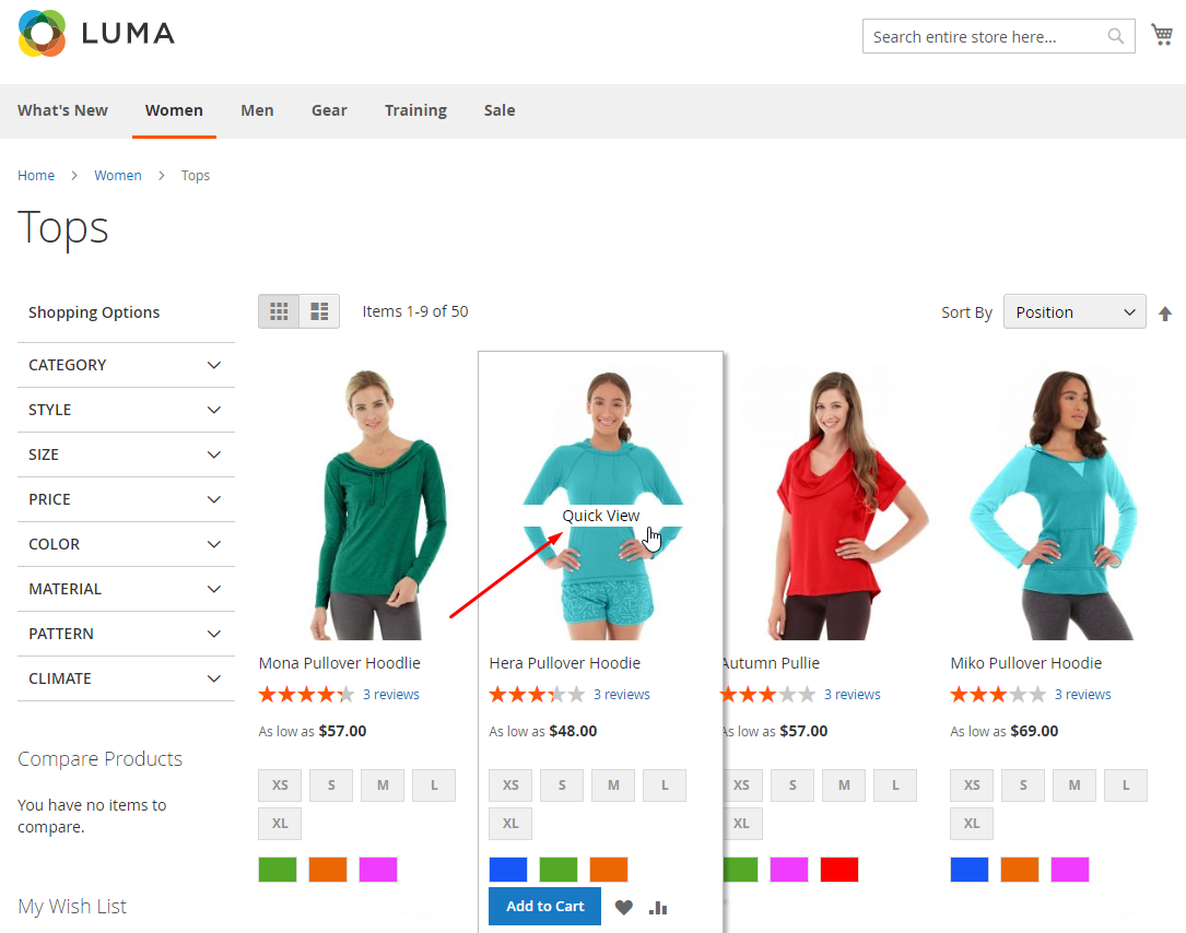
1.2. Display the label on the product
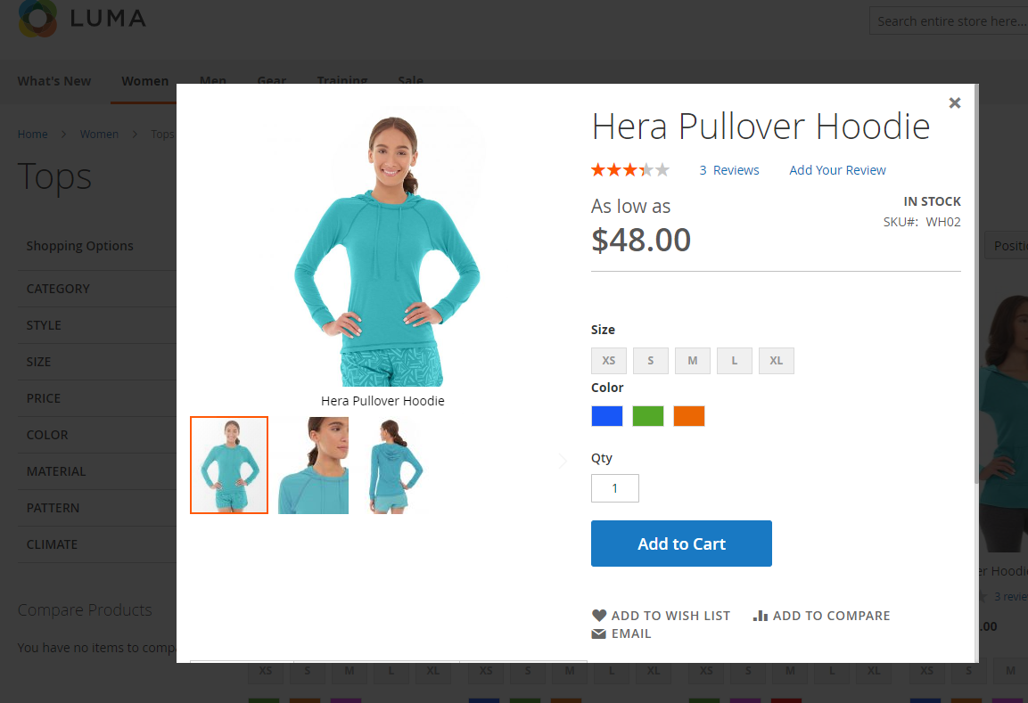
1.3. Display the popup
2. Ajax Cart
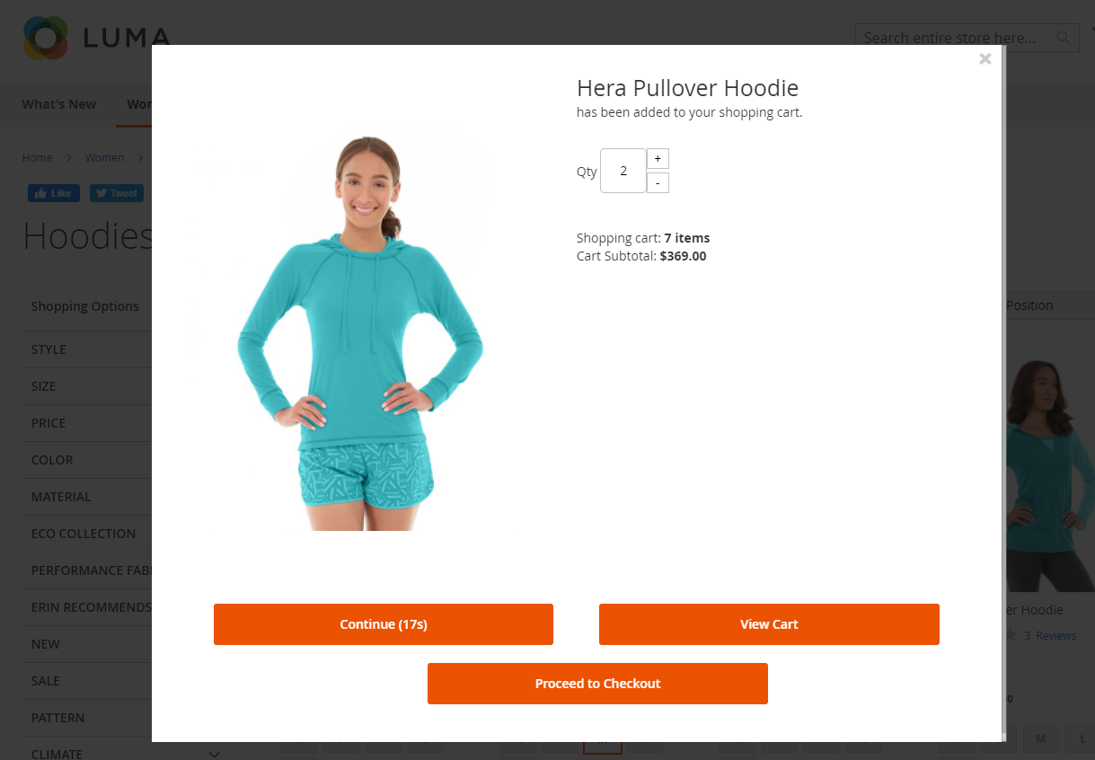
2.1. When clicking on Add To Cart button
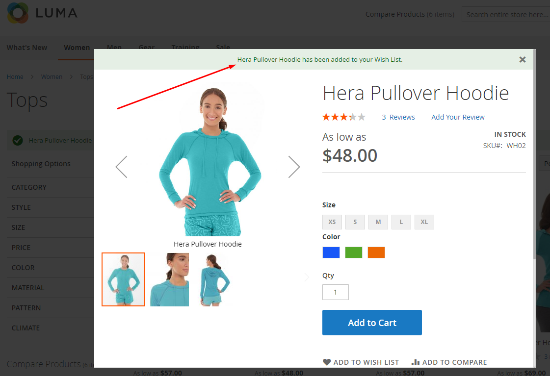
2.2. When clicking on Add To Wishlist
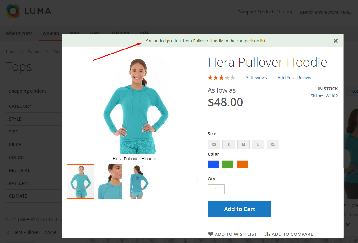
2.3. When clicking on Add to Compare
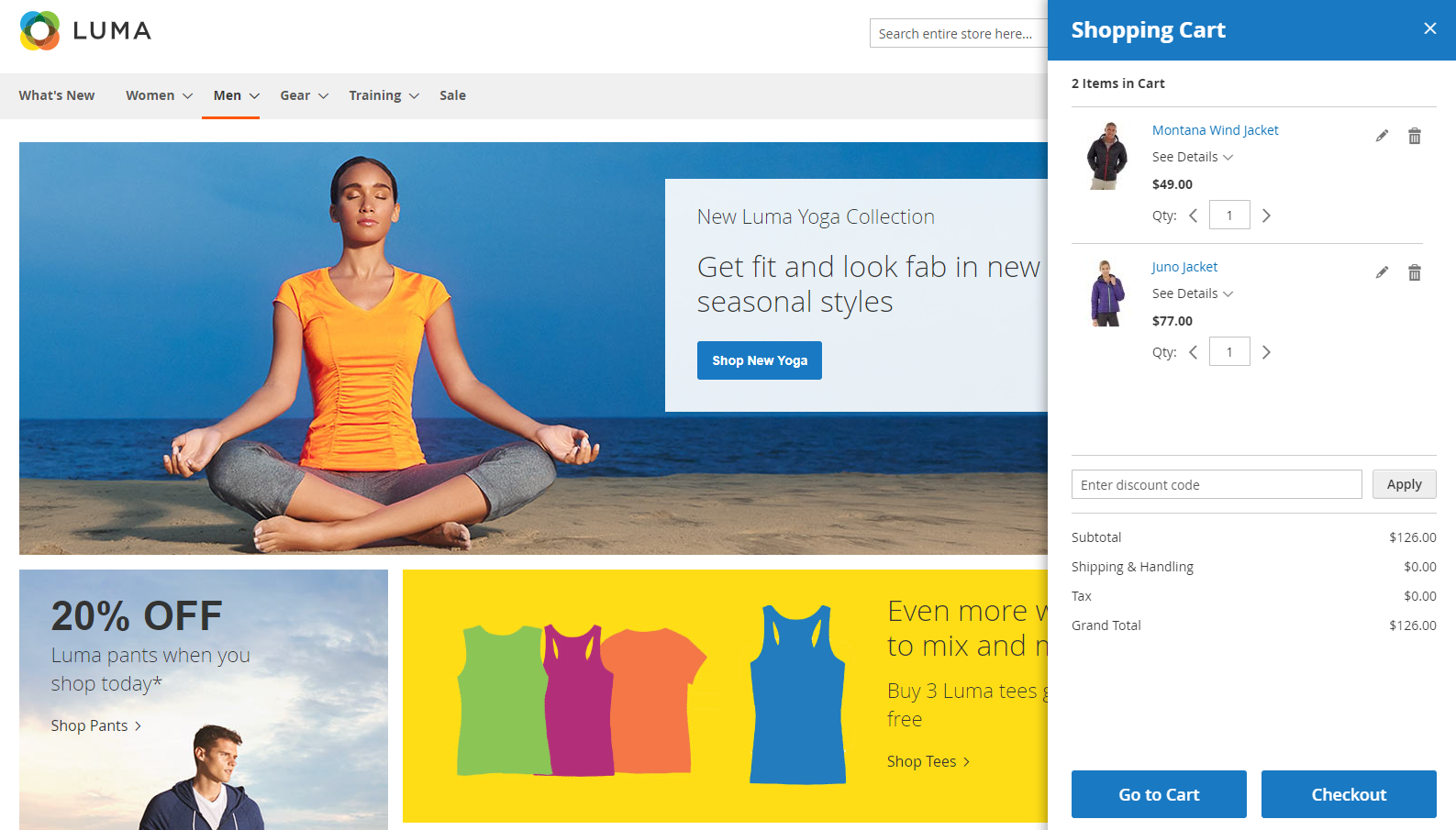
3. Minicart with new interface:
4. Automatically display minicart popup when hovering to cart:
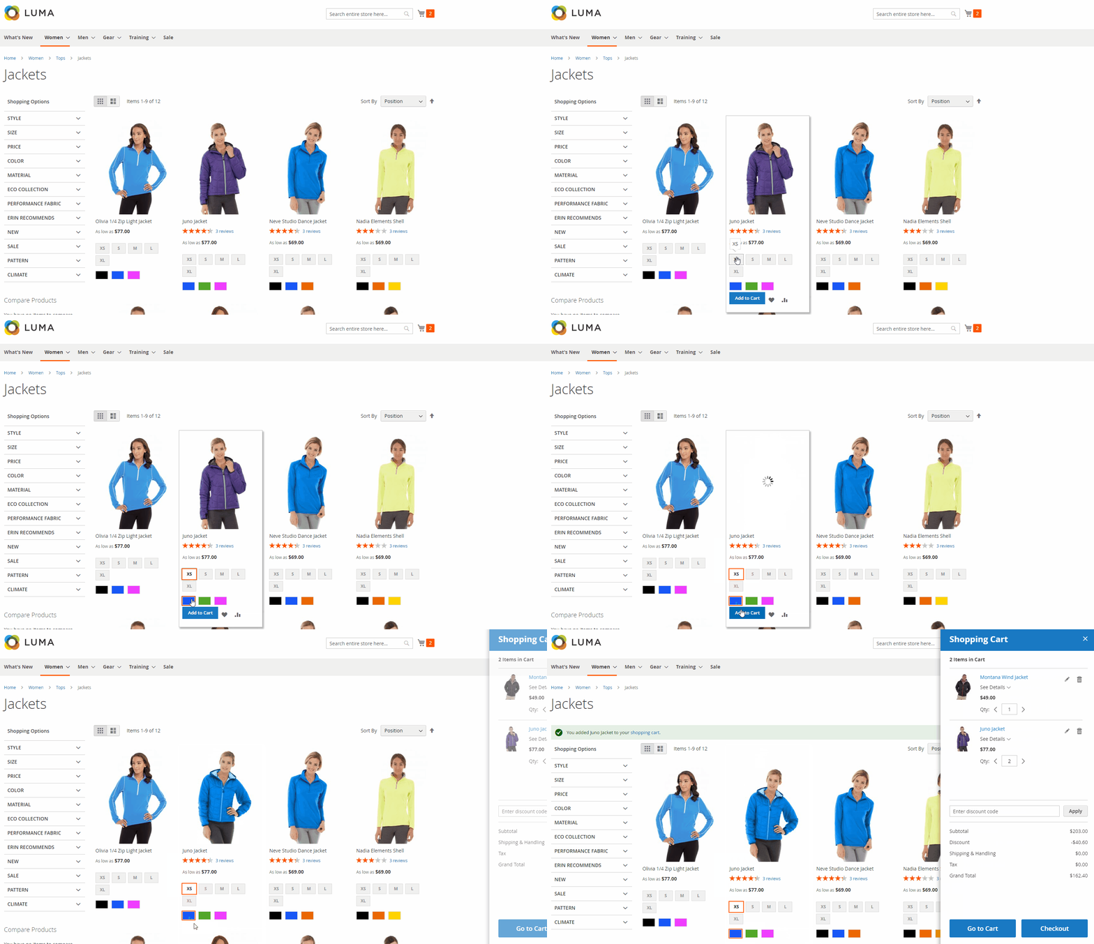
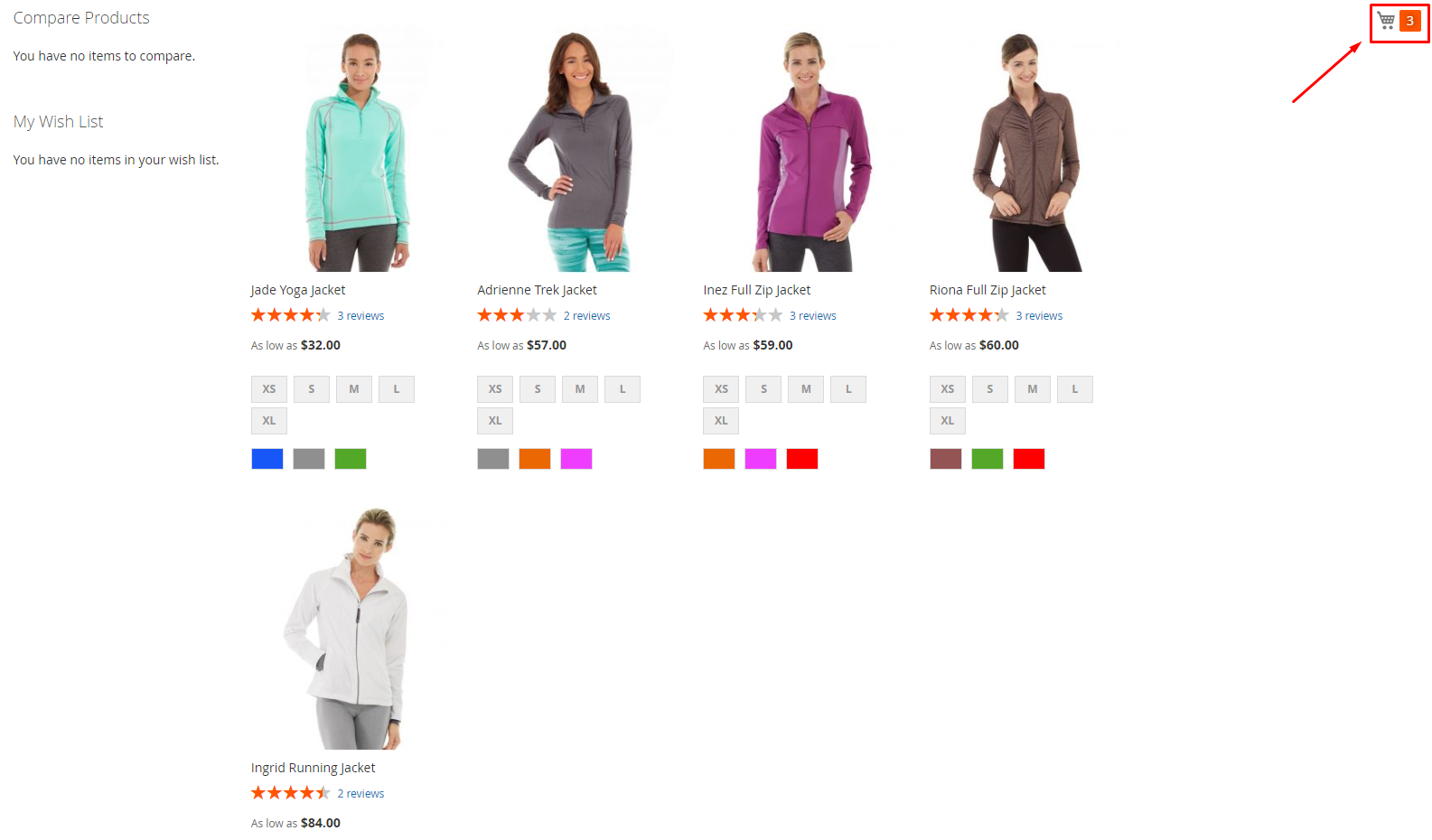
5. Always display the minicart when the page is scrolled down:
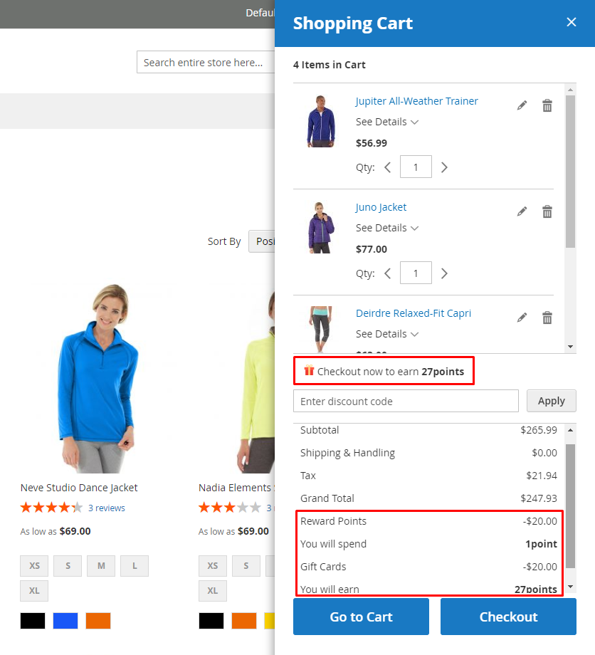
6. Compatible with Reward Points and Gift Card:
How to configure
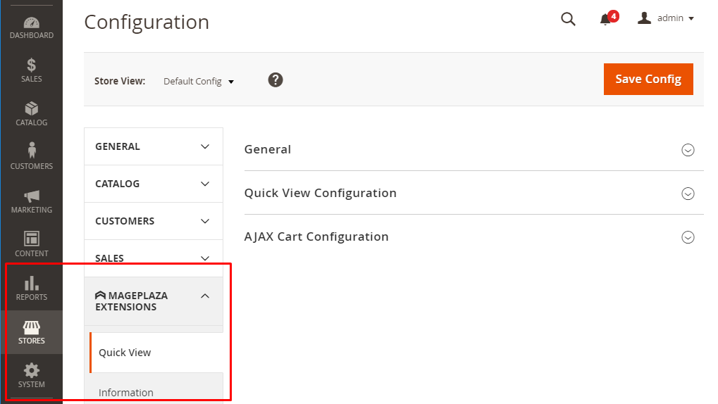
From the Admin Panel, go to Store > Settings > Configuration > MAGEPLAZA EXTENSIONS > Quick View
How to Configure
From the Admin Panel, go to Store > Settings > Configuration > MAGEPLAZA EXTENSIONS > Quick View & AJAX Cart
1. General
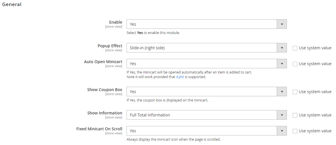
Enable: Select Yes to turn on the Module.
Popup Effect:
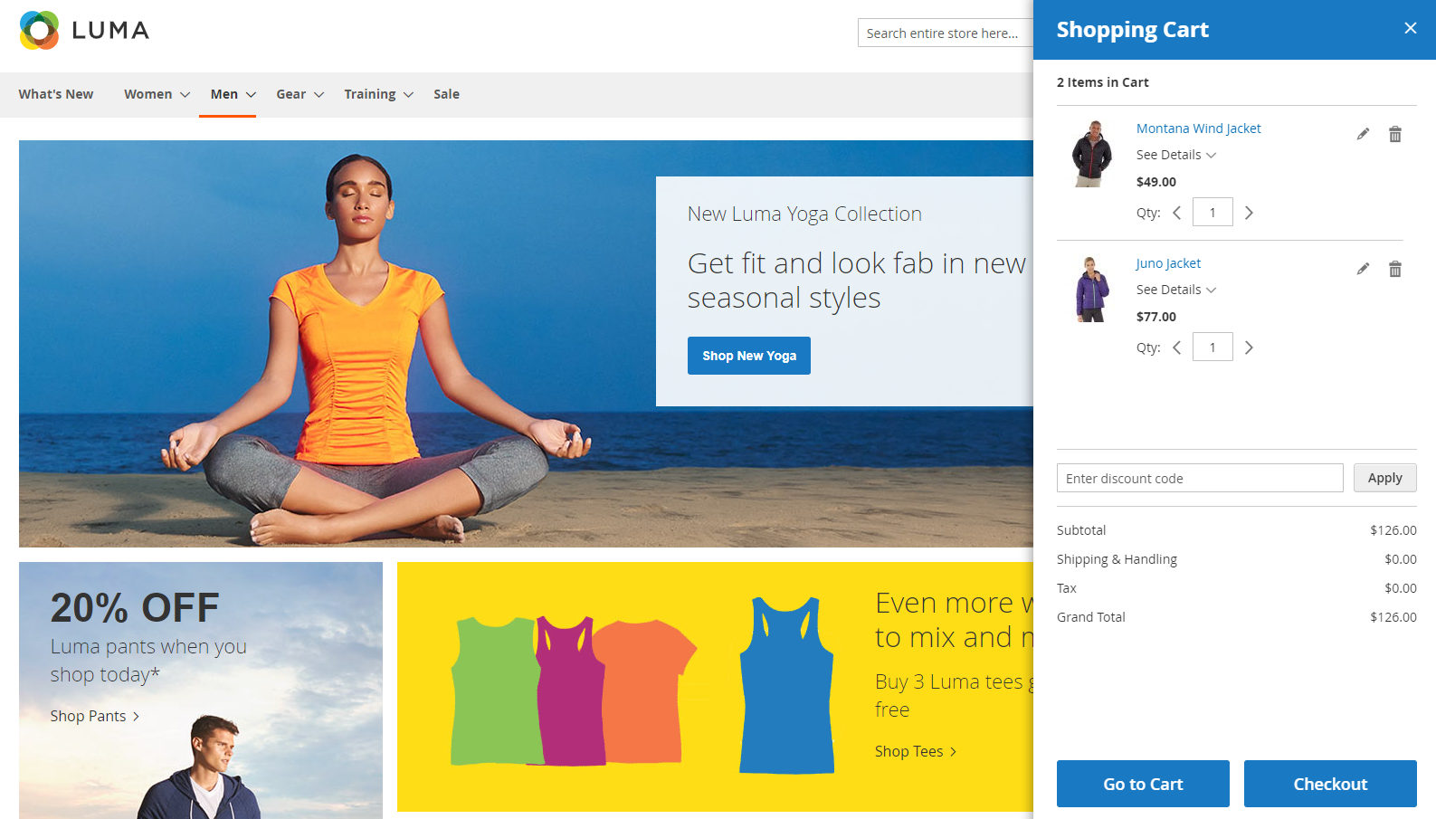
- Slide-in (right side): Display new popup minicart when clicking on cart:
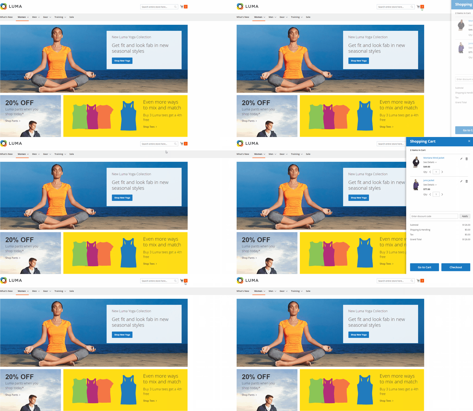
- Hover-over: Automatically display the minicart popup when hovering to the shopping cart
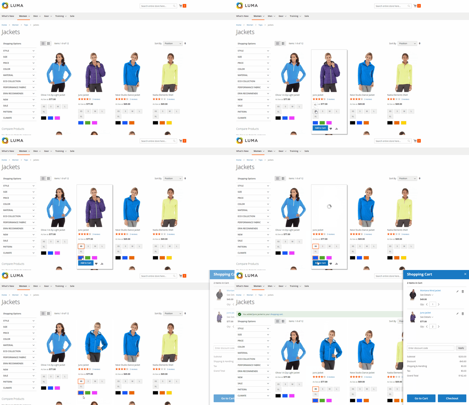
- Slide-in (right side): Display new popup minicart when clicking on cart:
Auto Open Minicart:
- Only displayed when at Popup Effect field, you select Slide popup (right).
- Minicart is auto displayed when customer adds product to cart.
- Note: this feature will work provided that AJAX is supported. If the page reloads after customers clicking on Add to Cart, it will not work (e.g. My Wishlist page, Recently Ordered, Catalog Products List widget, ..).
Show Coupon Box:
- Display the coupon filling box applied
- You can access
Marketing > Cart Price Rules, select Add New Rule to create new coupon rules - Instructions on how to create new rules can be found here.
Show Information:
- Full Total Information: Displays all information in minicart including: Subtotal, Discount, Shipping & Handling, Tax, Grand Total.
- Only Subtotal: Only displays Subtotal information in minicart.
Fixed Minicart On Scroll: Select Yes to always display the minicart icon when the page is scrolled.
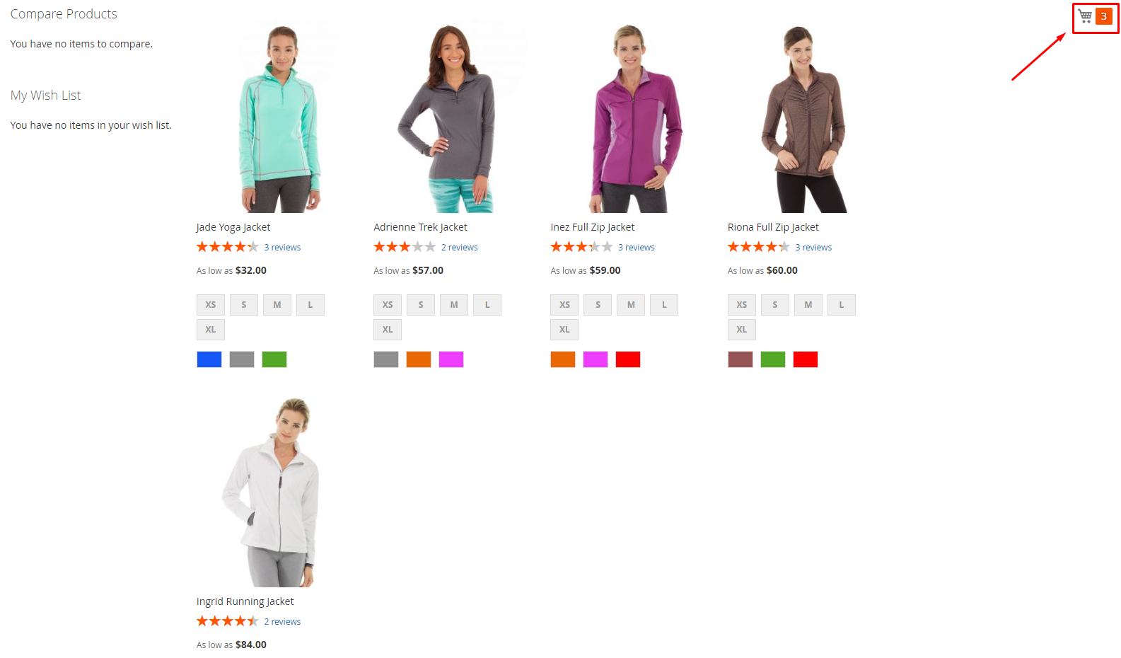
2. Design
From the Admin Panel, go to Stores > Configuration > Mageplaza Extensions > Quick Cart, select Design
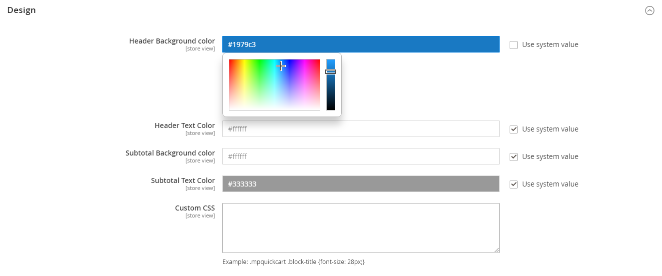
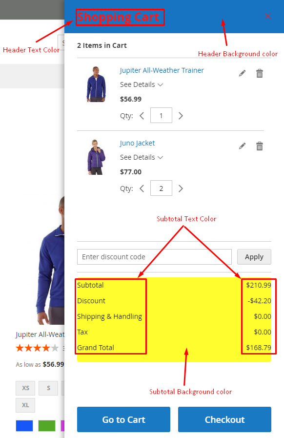
- Header Background color:
- Select the background color for the minicart header.
- If empty, the default color #1979c3 will be used.
- Header Text Color:
- Select the text color of the minicart header.
- If empty, the default color #ffffff will be used.
- Subtotal Background color:
- Select Subtotal background color.
- If empty, the default color #ffffff will be used.
- Subtotal Text Color:
- Select the font color in Subtotal.
- If empty, the default color #333333 will be used.
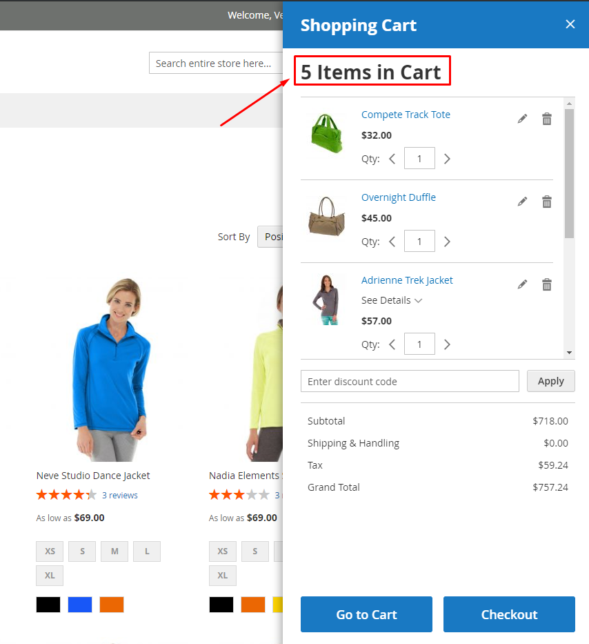
- Custom CSS: you can write CSS code here, it not only can change colors but also many other things
- Example: At the Custom CSS field, you fill in
.mpquickcart .block-title {font-size: 28px;}, then at Frontend, it will display the bigger size of text indicating the item number in the cart ( see picture below)
3. Quick View Configuration
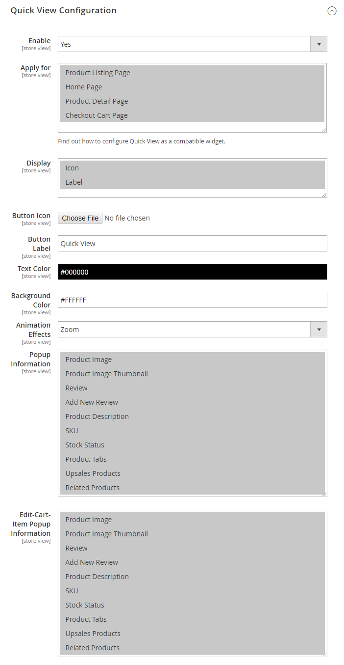
- Enable: Choose "Yes" to display the popup of Quick View
- Apply for:
- Choose the page to display the popup of Quick View. For example: Select
Apply for = Home Page, then when customers click on the icon or label on the products on homepage, it will display the popup of Quick View only. On the other pages, it will not display. - The popup can be displayed on many pages
- It's compatible with Widget
- Choose the page to display the popup of Quick View. For example: Select
- Display:
Display = Icon: Allow showing the icon on the product's imageDisplay = Label: Allow showing the label on the product's imageButton Icon: You can use the default icons or upload the icons. This icon will display on the product's image.Button Label:- Enter the label that display on the product's image
- The default label is Quick View
Text Color: Choose the color for the labels displaying on the product's image. The default color is #000000Background Color: Choose the background color forButton Label. The default color is #FFFFFFAnimate: Allow choosing the animation displaying in the popupPopup Information:- Choose the product information displaying on the popup when you click on the icon or button label on the product
- Allow displaying many product's information on the popup
Edit Cart Item Popup Information:- Choose the information of the product displaying on the popup when you click on the icon or button label on the Cross-Sells product added to the cart on the Shopping Cart page. Or when you click on the
editicon on the product added to the cart - Allow displaying many product's information on the popup
- Choose the information of the product displaying on the popup when you click on the icon or button label on the Cross-Sells product added to the cart on the Shopping Cart page. Or when you click on the
4. Ajax Cart Configuration
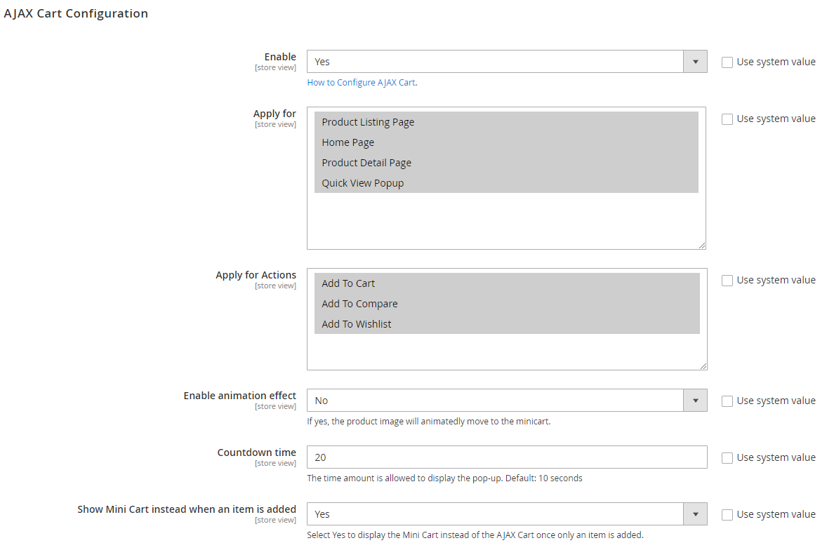
- Enable: Choose "Yes" to display the popup of Ajax Cart
- Apply for:
- Choose the display page the popup of Ajax Cart. For example: Choose
Apply for = Home Page, when customers click on the icon or the label or click on Add To Cart button on the product on homepage, the popup of Ajax Cart will be displayed. On other pages, the popup will not be displayed. - Allow displaying the popup on many pages
- Choose the display page the popup of Ajax Cart. For example: Choose
- Apply for Actions:
Apply for Actions = Add To Cart: Display the popup of Ajax Cart when customers press on Add To Cart buttonApply for Actions = Add To Compare: Display the popup of Ajax Cart when customers press on Add To Compare button on Quick View PopupApply for Actions = Add To Wishlist: Display the popup of Ajax Cart when customers press on Add To Wishlist button on Quick View Popup
- Enable animate Add To Cart: Choose "Yes" to use the animation feature of the products. It will auto-fly into the cart after pressing the
Add To Cartbutton - Countdown time:
- Enter the number of seconds displaying for the popup of Ajax Cart
- The default Ajax Cart popup is 10 seconds
- Show Mini Cart instead when an item is added: When there is only 1 item is added to cart, display the mini cart instead. From the second item, display the ajax popup
5. Increasing Sales Options
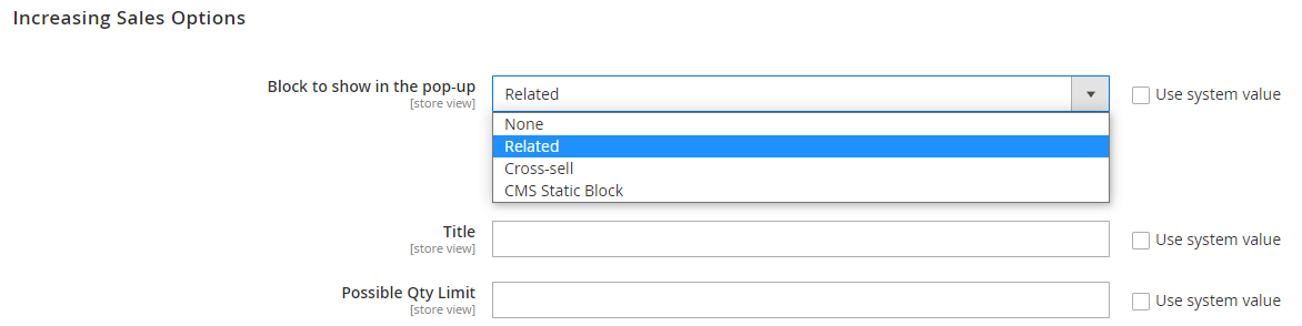
- Block to show in the pop-up: Select blocks displayed at Ajax popup when customers add to cart
- Block to show in the pop-up = None: Do not show additional block
- Block to show in the pop-up = Related: show Related Product block on on Ajax popup. After selecting this option, you will see Title and Possible Qty Limit fields
- Block to show in the pop-up = Cross-sell: show Cross-sell Product block on Ajax popup. After selecting this option, you will see Title and Possible Qty Limit fields
- Block to show in the pop-up = CMS Static Block: show CMS Static Block on Ajax popup. After selecting this option, you will see Block field
- Title: Type in the title for the block. This filed is displayed only when Block to show in the pop-up = Related or Cross-sell
- Possible Qty Limit: type in the limit number for showing products on the block. This filed is displayed only when Block to show in the pop-up = Related or Cross-sell
- Block: Choose the block displayed from the droplist. This filed is displayed only when Block to show in the pop-up = CMS Static Block
6. Visual Settings
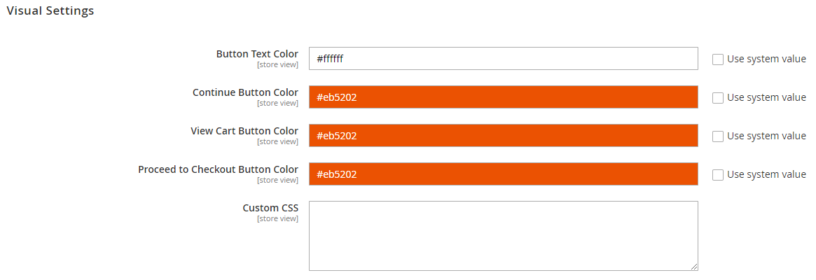
- Button Text Color: select the text color for button on Ajax popup
- Continue Button Color: select the color for Continue button on Ajax popup
- View Cart Button Color: select the View Cart button on Ajax popup
- Proceed to Checkout Button Color: select the color for Proceed to Checkout button on Ajax popup
- Custom CSS: you can customize the display with CSS here
7. Compatible with Widget
To insert the code, you use the following code:
{% raw %}
{{block class="Mageplaza\QuickView\Block\QuickView\Popup"template="Mageplaza_QuickView::quickview/widget/button.phtml"}}
{% endraw %}
then add it into anywhere you want to display Quick View Popup.
You can add it on one page or one block by going to Content > Page. Also, you can insert it into .phtml, .xml files of Magento as well as other extensions that you want to display the popup.
8. Compatible with Reward Points
With Reward Points integration, it allows displaying the total number of points of the shopping cart that customer can get after payment in minicart. Also, it enables displaying the number of reward points that customer uses to deduct from the total cart.
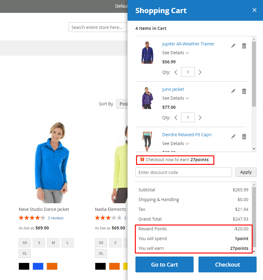
9. Compatible with Gift Card
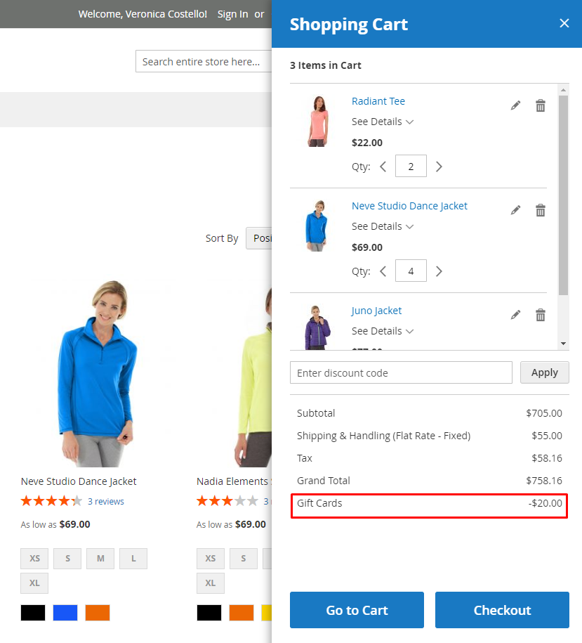
With the Gift Card integration, it allows showing more on the total, including the amount of discount due to Gift Card code or Gift Card Credit: